ABOUT THE PROJECT
Improving Professional
Online Presence
This work was completed as part of my Working In A Digital World module in
final year of university. The brief was to create a set of professional materials that would
help prepare us for entering industry.
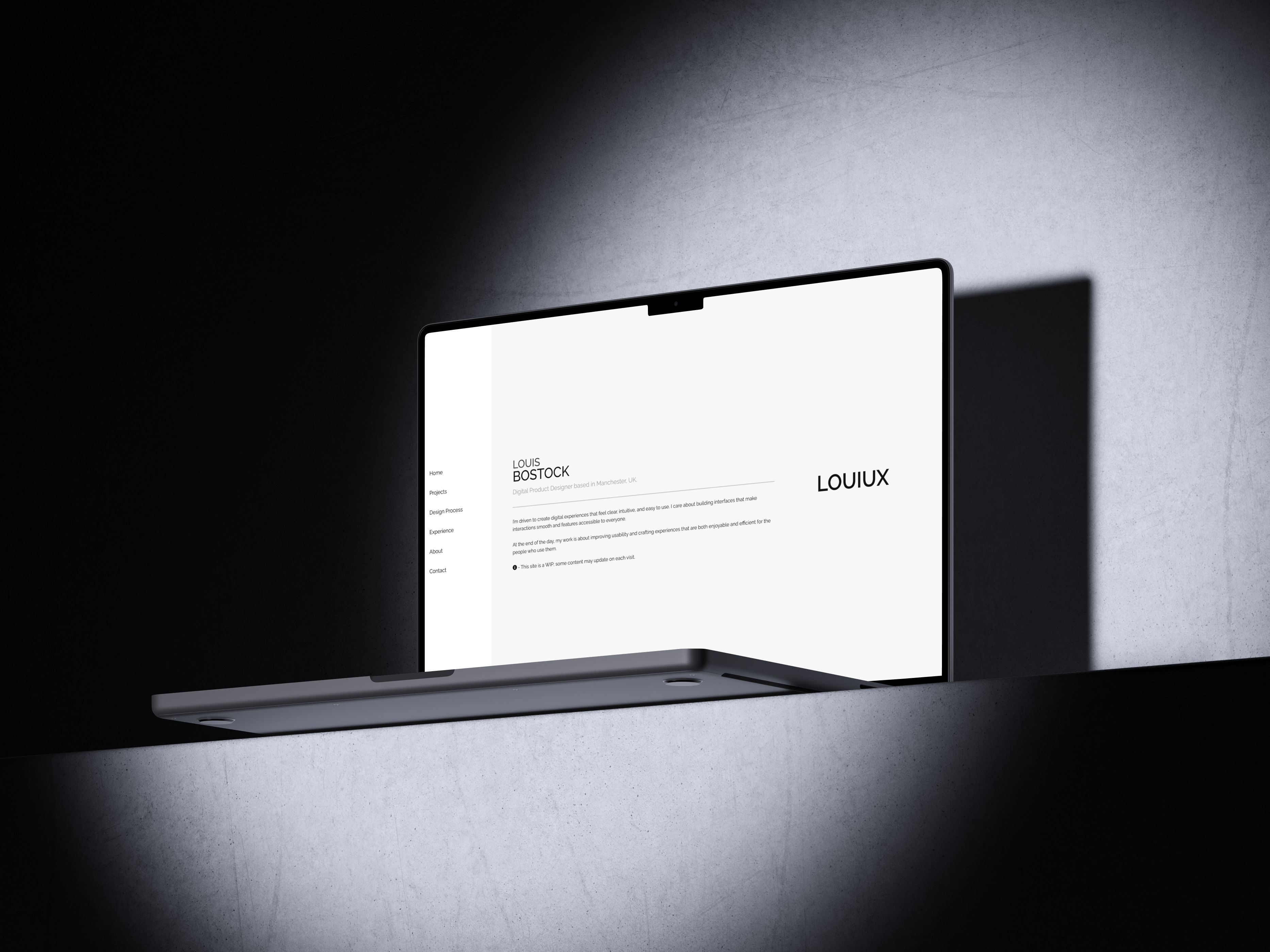
I developed this personal portfolio website by coding it in VS Code, focusing on clean
structure,
clear navigation, and a layout that effectively showcases my projects.
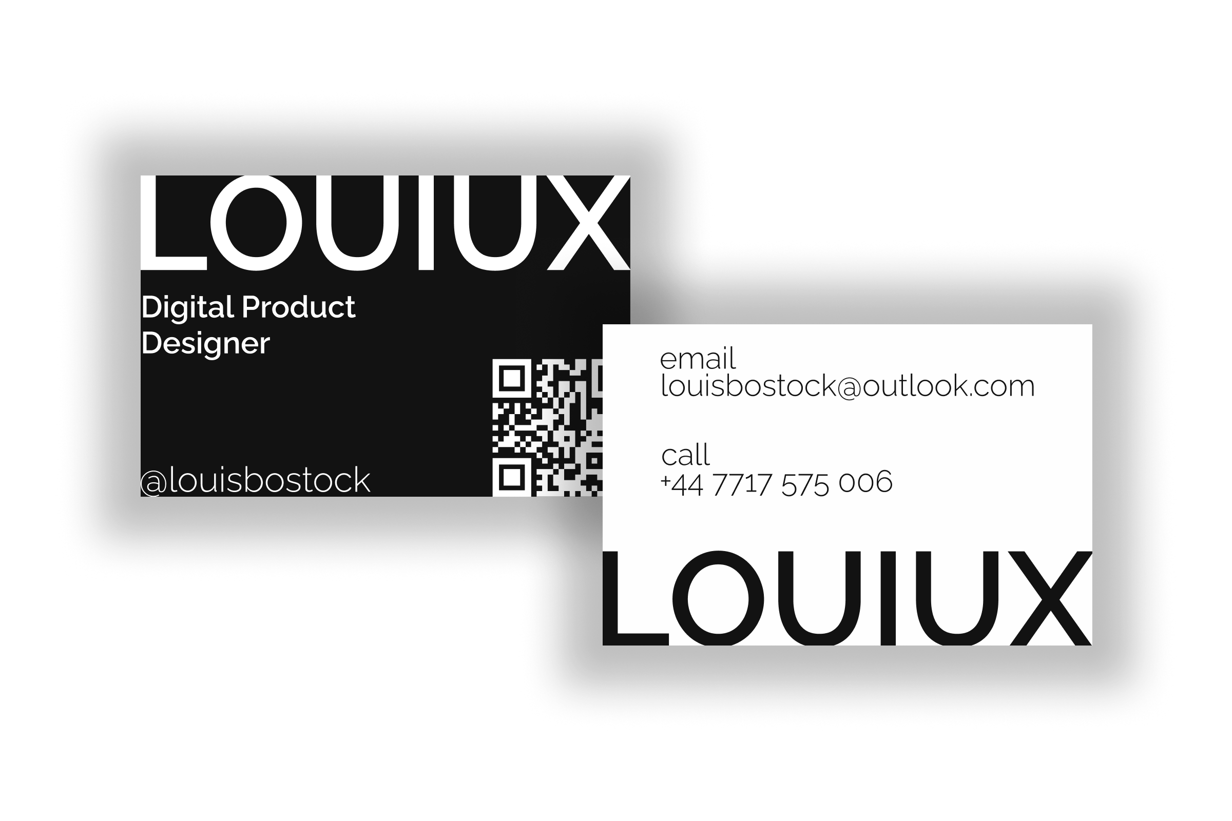
Alongside this, I designed a professional business card in Figma, exploring visual identity,
typography, and brand consistency.
To build an online presence, I also created an Instagram page dedicated to my work, allowing me
to present my projects in a visual, accessible format.
ROLE
UX/UI Design
Web Developer
CLIENT
University project
DATE
September 2025 - December 2025
Creative Inspiration
I also looked to the artist William Lachance’s website when developing my side navigation. This layout choice showcases a modern, unconventional approach—moving away from the typical top navigation to create something more distinctive. It also allowed me to demonstrate my coding and web-development abilities by implementing a navigation style that’s both functional and visually engaging.
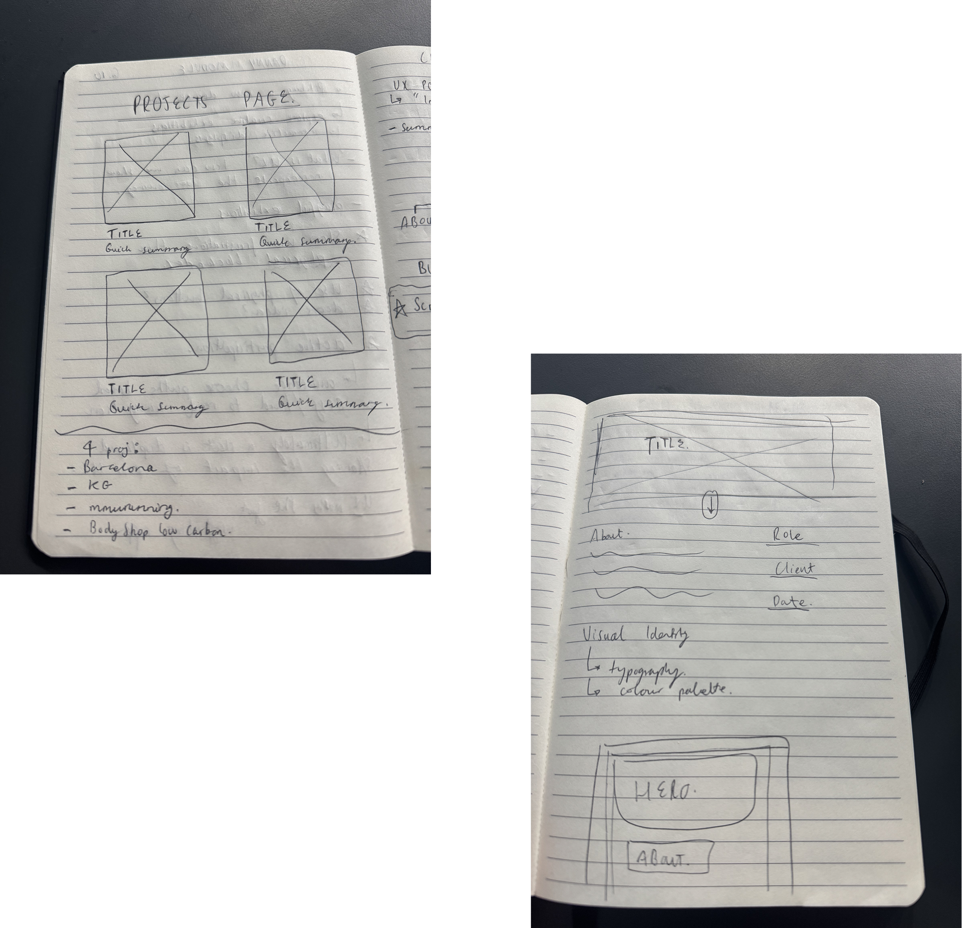
Sketches
Having a clear visual reference made it easier to determine whether a row or column configuration was best suited for each section. While tools like Figma could have achieved the same outcome, pen-and-paper wireframing offered a faster and more intuitive way to iterate in the early stages.
Choice of Tools
VS Code has become a familiar and efficient workspace for me throughout my university studies and during my client-facing project with Knowles Green. While I used GitHub to host the site, I’ve also recognised an area for improvement: incorporating clearer commit messages to better align with industry best practices in version control.
For branding elements, including my logo and business card, I used Figma to design clean, cohesive visuals that complement the overall look and feel of the site.

Style Guide
To keep the visual experience uncluttered, I intentionally limited the colour palette. Aside from black and white, the only additional colours appear in the hover states of the navigation items or negative / positive text. This restraint prevents visual overload and ensures that any colour used within my showcased projects becomes the focal point—allowing the work itself to stand out without distraction.
TYPOGRAHY
Raleway
Louiux
Aa123
COLOURS
#f7f7f7
#ffa500 - hover
#9a2424 - negative, light mode
#FF8002 - negative, dark mode
#008000 - positive
The Work In Progress...
Peer Feedback
Through think-aloud testing, one of my peers suggested the following:
- Case Studies
- - Limited depth
- - Screenshots were confusing
- Projects Page
- - Preview descriptions were too long
- Colour & Accessibility
- - Deep red text colour on black background was hard to read
Reflection & Adaptation
- Case Studies
- - Limited depth → Added 'problem to solution' orientated storytelling
- - Screenshots were confusing → Created & used mockups instead
- Projects Page
- - Preview descriptions were too long → Cut down to single line, easier to read
- Colour & Accessibility
- - Deep red text colour on black background was hard to read → Made use of an online accessibility checker to choose new colours for light & dark mode