ABOUT THE PROJECT
Knowles Green
Wine & Cheese
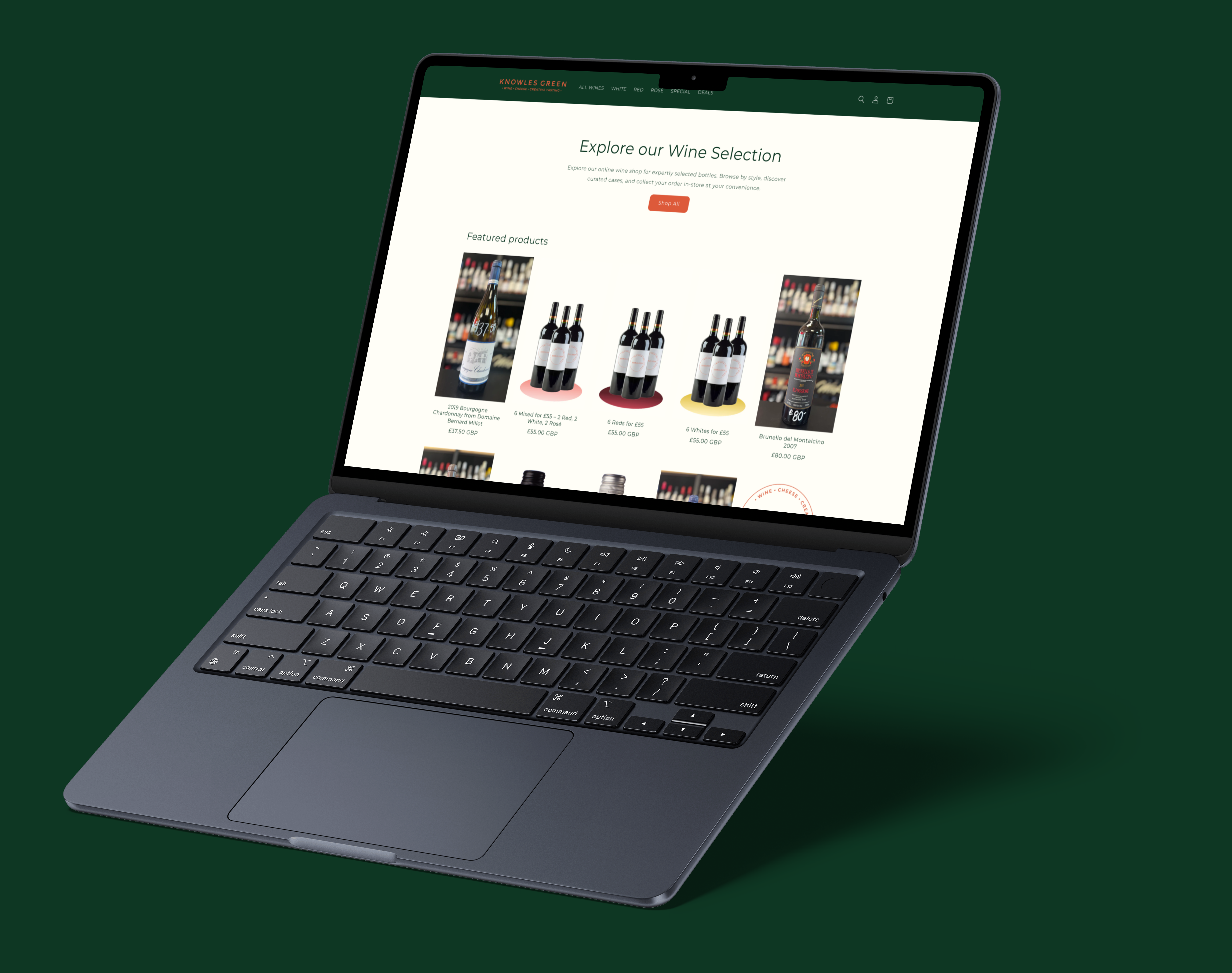
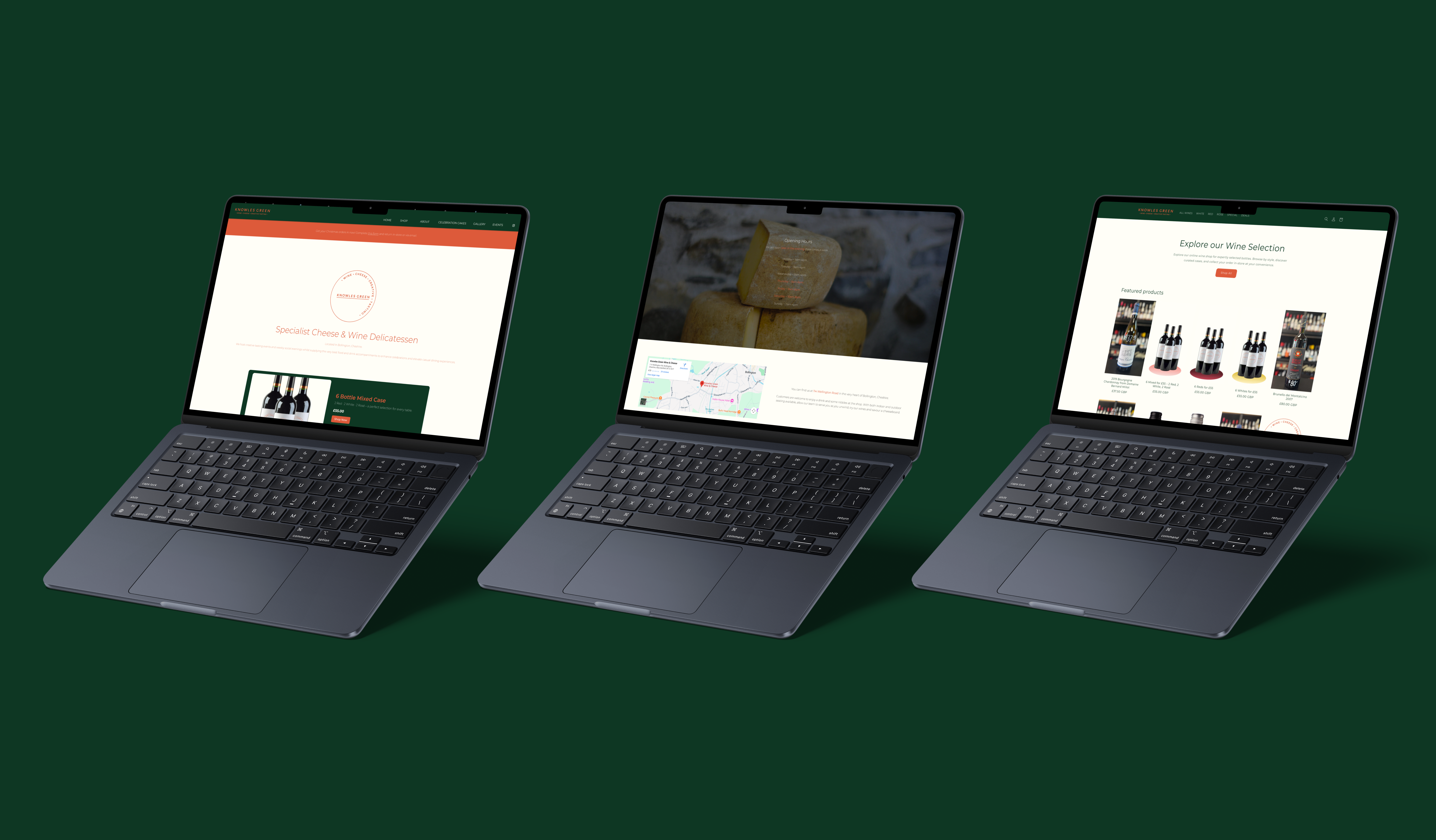
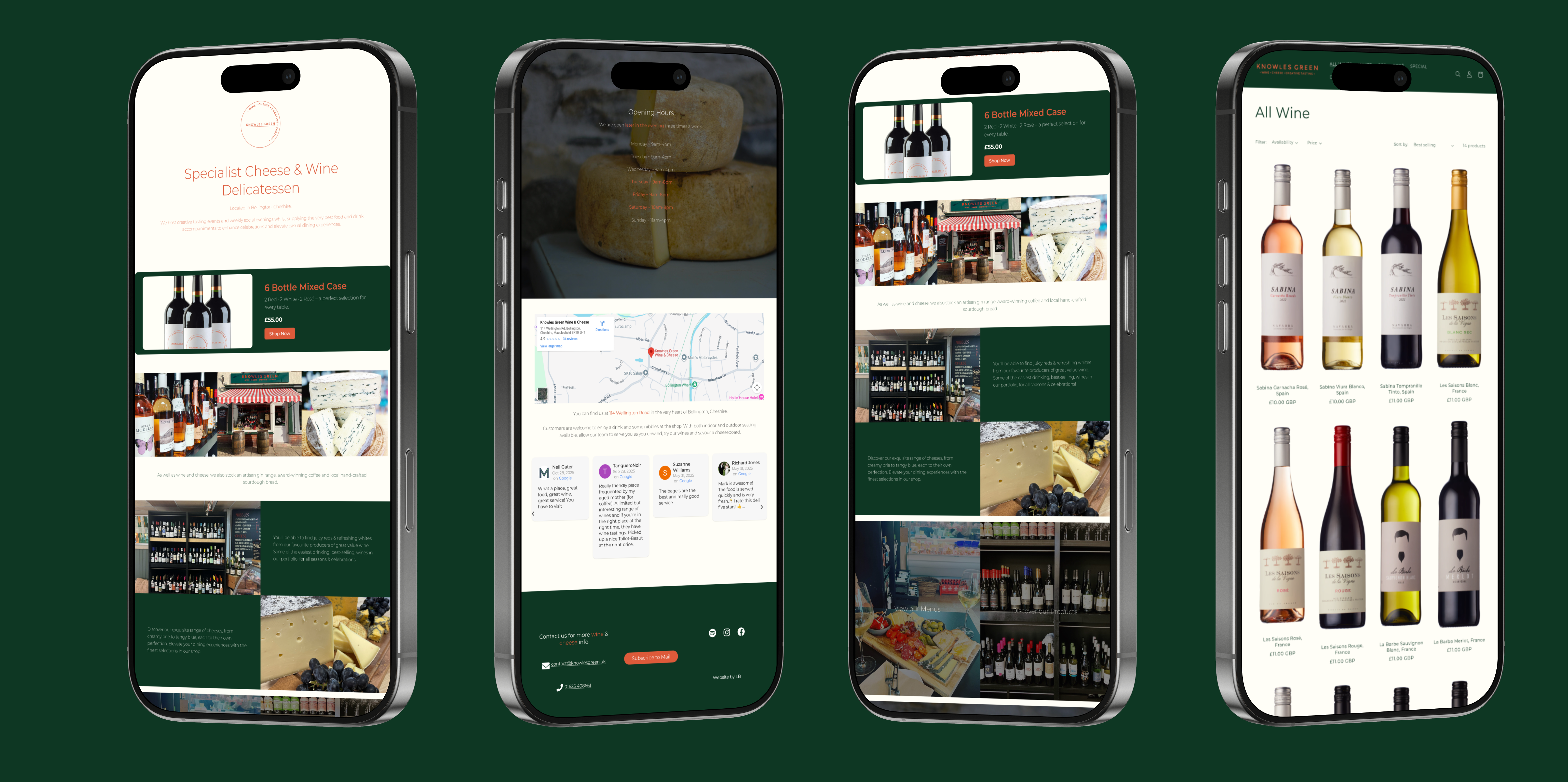
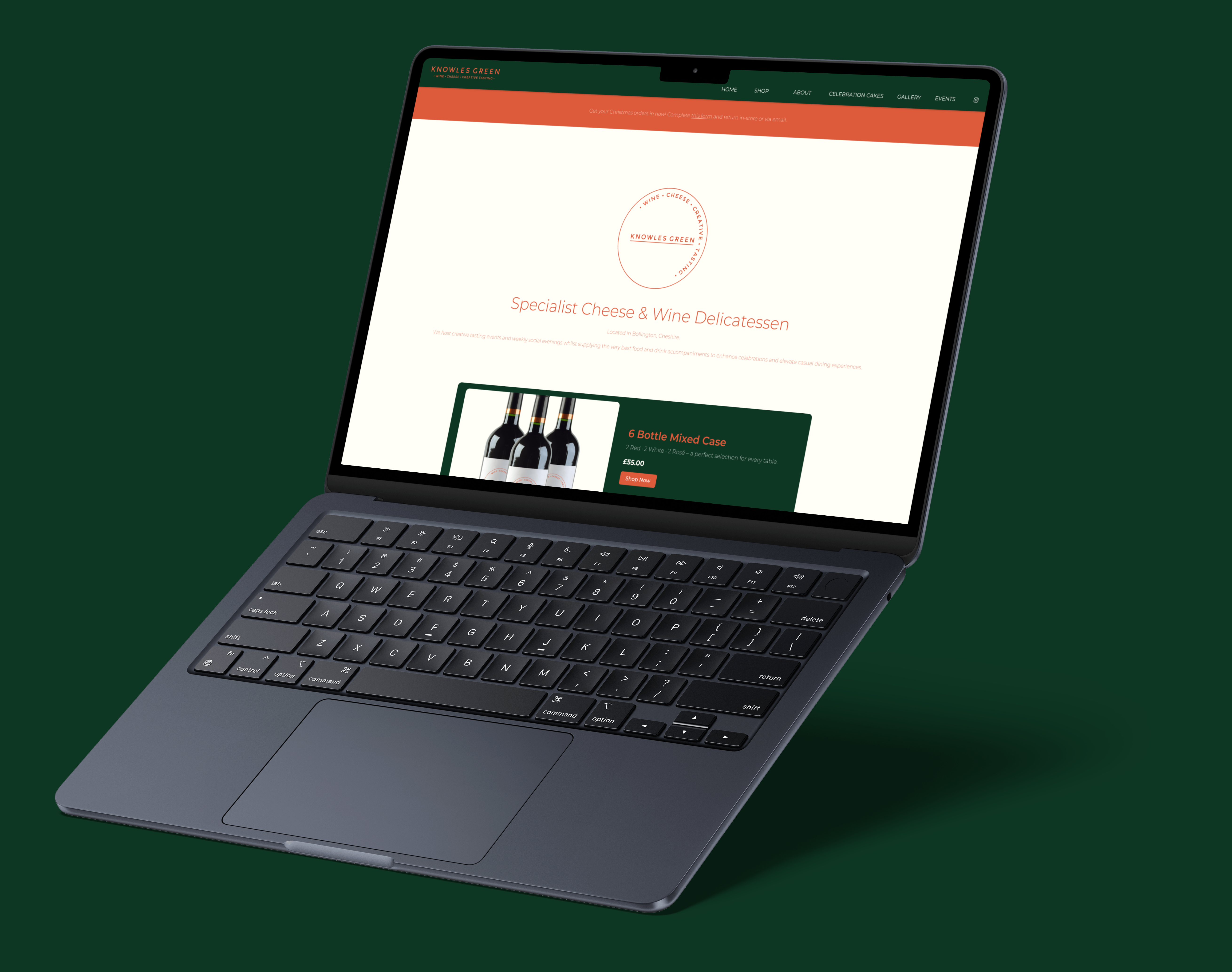
I designed and developed the website for Knowles Green, a boutique wine and cheese delicatessen based in
Bollington, Cheshire. The goal was to create an elegant, user-friendly platform that reflects the brand’s
passion for fine food, wine, and hospitality.
Alongside a clean, responsive layout and intuitive
navigation, I set up a fully integrated online shop to showcase and sell their curated wines,
cheeses, and gifts.
Working closely with the owners, I focused on blending functionality with
storytelling—using refined design, engaging visuals, and clear messaging to capture the warmth and quality
of the Knowles Green experience both online and in-store.
ROLE
User experience designer
Web developer
CLIENT
Knowles Green Creative Tasting
DATE
Summer 2024 - Present
Visual Identity
Creating clean, elegant branding with refined fonts and warm, earthy tones to reflect the artisanal character of Knowles Green, a boutique cheese and wine shop.
Branding inspired by earthy sophistication, using deep green tones with orange highlights and a cream base to convey warmth, quality, and tradition.
TYPOGRAHY
Montserrat
Knowles
Aa123
COLOURS
#0e3723
#dd5a3a
#fffef7
Identifying The Problem
Knowles Green's previous site suffered from:
- Visual Issues
- - Incoherent colour scheme
- - Text not fitting screen
- - Images too big for mobile
- Interaction Issues
- - Website unusable on mobile
- - Lack of information
- - Unclear navigation
- Performance Issues
- - Unnecessary media, images, and page loads
- - Images not optimised
- - Images not loading properly
Because the old website was unresponsive, customers often abandoned it, frustrated by slow loading and poor usability.
How I Solved The Problem
- Visual Issues
- - Incoherent colour scheme → Applied a consistent earthy palette of green, orange, and cream
- - Text not fitting screen display size → Implemented responsive typography and flexible layouts
- - Images too large for mobile → Optimized images for faster load and better display on all devices
- Interaction Issues
- - Unclear navigation → Redesigned intuitive menu structure and added visual cues
- - Lack of information → Enhanced content clarity and storytelling throughout the site
- - Website unusable on mobile → Fully responsive design for seamless mobile experience
- Performance Issues
- - Images not loading → Compressed and optimized media for reliable performance
- - Images not optimised → Reduced file sizes without compromising quality
- - Slow loading times → Streamlined assets, cleaned up code, and improved overall site speed